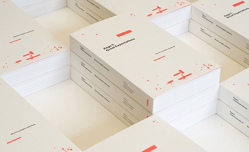
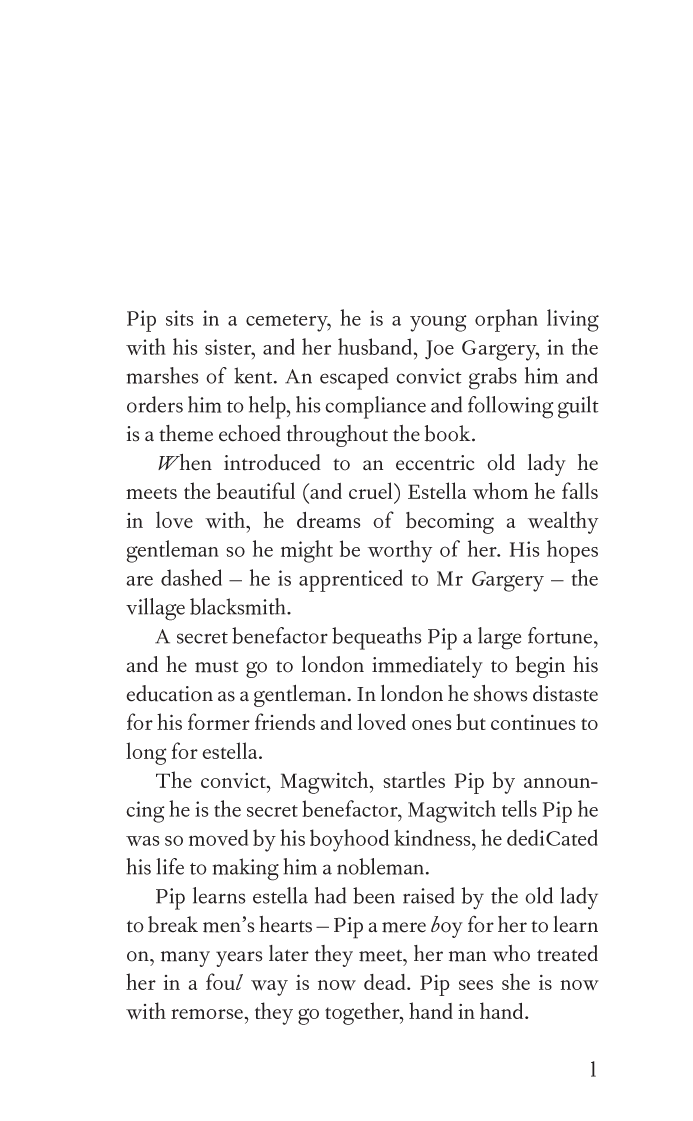
Great Expectations
Designed by North
To coincide with the 200th anniversary of Dickens’ birth, GraphicDesign& asked North, along with 69 other designers to create their own Page 1 of this classic novel.
Rationale:
Playing on the idea of expectations and combining with our role as not only designers but curators of information we have broken down the text on the first page of Dickens’ novel to create a synopsis of the book. Encapsulating our task of simplification when communicating complex ideas we have limited ourselves to characters that appeared in the original text. The remaining letters and punctuation that aren’t needed, have been removed. The result is a succinct abridgement of the novel.
The text has been classically set using Monotype’s Fournier, 11pt, a revival of a typeface originating in France during the 18th Century.
These are the superfluous characters: ’‘kkkkkdeeeeeeeeeeeeeeeeeeeeeeezmmmmmmmmmmmmmnnnnnnnnnnhhhhxxxvvvvvvvvvvvuutttttttttttttttttttttttttttttttt1iiiiiiiiiiiiiiiiiiiiiiisssssffffffffffffffffffffggooooooooooyyyyyyyyyyyyyywwwwwww,,,,,,,,,,aaaaaaaaaaaaaaaaaaaaaaaarrrrrrrrrrrrrrrrrrrrrrrrrrrrrrrrrrrrrAAFIIIIIORSTT“”
Featured articles:
Eye Magazine